
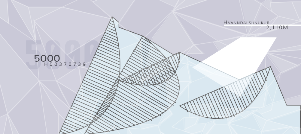
The design uses a cool color palette, and is based of of the land of Iceland as well as its current currency note. The imagery used in the note uses complex overlays, an engraved image, geometric shapes, and lightweight fonts. I wanted to express the natural beauty of Iceland and also describe what area of the world Iceland was located in. I wanted to show nature landmarks such as mountains, waterfalls, and the aurora borealis, as well as its climate by using an icy palette.I used the Root 5 and Phi rectangles overlapping to mimic Iceland’s current currency note. My design was based on these two rectangles and their armatures. To further its legitimacy, I added counterfeiting deterants, and aids for visually imaired.

Initial Mock-Ups

Digital Comps


I decided to go with a cool, analogous color palette, with a touch of red. I wanted to the colors to represent the region from which the currency was for, and also wanted it to have aspects of the currently used currency note for the region.

I used dynamic Root 5 and Phi rectangles to orginize the items in my currency. I chose the root 5 and phi rectangles because they are the armature grids used in the current Icelandic currency.


Final Currency

Front

Back


